
The Microsoft Design team has given us a peek behind the curtain, revealing not only the updated Start menu coming to Windows 11 this year but also several design concepts they explored along the way.
It’s a reminder that every small change in Windows often follows months of brainstorming, testing, and refining. Even when it’s not visible to users, there’s a thoughtful process shaping every decision.
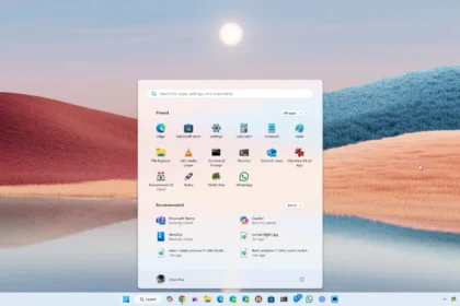
The Windows 11 start menu continues to improve
The Microsoft Design team set out with a clear mission: to keep alive a promise made decades ago-having everything just one click away. Though the digital world has evolved drastically in the last 30 years, that core idea still guides their work. To bring it into the present, they’ve focused on four key principles:
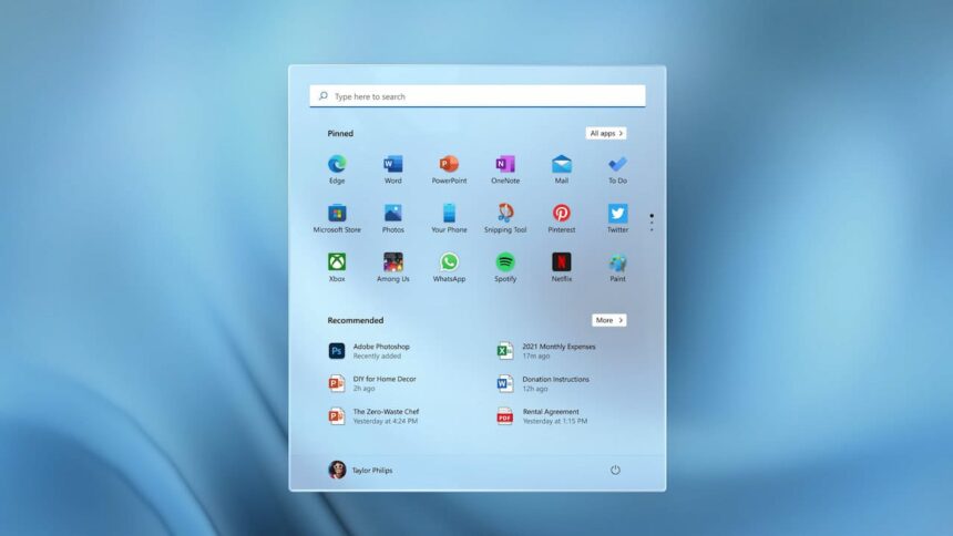
- Apps at a glance – Whether recently installed or long-time favorites, your entire app library should be visible and accessible right away.
- Personal space – The Start menu should feel like an extension of your workspace, tailored to your needs, showing only what matters to you.
- Efficiency first – Every detail, down to the pixel, is designed to save time and streamline daily tasks so users can focus on creating.
- Respect the familiar – With decades of habits built around Windows, the design aims to modernize without erasing what people already know.

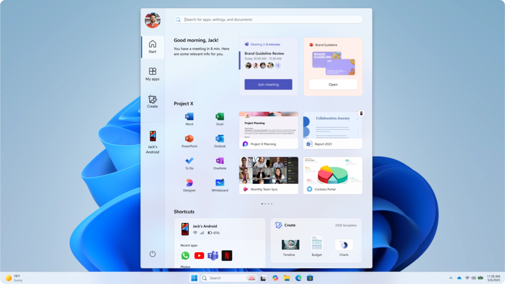
After gathering feedback from 300 testers and carefully studying how they interacted with various layouts, the team landed on a refined version of the Start menu-not a radical reinvention, but a smart evolution. It’s more customizable, more responsive, and better suited to the way people actually use their devices.
While some users still miss the Windows 7 menu or prefer how macOS handles things, Windows 11 isn’t trying to be a copy. It borrows the best ideas from its past while learning from its missteps. Windows 7 had its time-and much of what made it great still lives on, just with a fresh coat of paint and modern touches.


