
If we look back at the history of Windows, there’s a clear divide – the time before and after Windows. Since the release of Windows 95, the right-click menu, also known as the context menu, has been a quick and essential shortcut for everyday tasks, enabling users to bypass ribbons and complex menus.
With Windows 11, Microsoft attempted to bring order to this long, cluttered list through a cleaner, modern redesign. However, over time, as apps and extensions added their own options, the menu once again became an endless scroll of repeated and irrelevant entries.
Now, Microsoft is ready to tackle the problem head-on with a new design concept called the Split Context Menu – a UI pattern that groups related actions under a single entry, complete with a small side submenu. In internal demos, Microsoft claims this change can reduce menu height by up to 38%, depending on the file type.
What Is the Split Context Menu?
At its core, the idea is simple yet highly practical in terms of user experience (UX). Each menu row now combines a main action (triggered by a click) and a secondary flyout (opened by hovering or clicking a small arrow).
Instead of seeing “Open with Photos,” “Edit with Photos,” and “Set as background” listed separately, you’ll see “Open with Photos,” with a small arrow to the right revealing related tools, such as Paint or Snipping Tool.
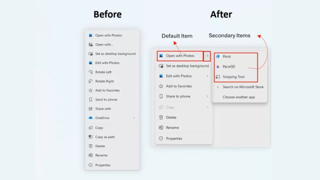
The feature is powered by SplitMenuFlyoutItem, a new control built into WinUI 3 as part of the Windows App SDK. It lets developers define the default (primary) action while nesting less-used functions inside a compact, secondary menu – without removing access or breaking existing workflows.
This change means:
- Less clutter: Repeated entries disappear, making menus shorter and easier to read. Microsoft’s tests show reductions of 30–38% in overall height for images, code, and text files.
- Smarter context: Menus now display only actions relevant to the selected file type – for example, showing Notepad for
.txtfiles and other editors under the flyout. - Simpler development: Developers can easily assign default and secondary actions thanks to the clear, modern API of WinUI 3 and the Windows App SDK.
When Will It Arrive?
Microsoft first showcased this change during a WinUI Community Call and in new developer documentation. However, it hasn’t yet appeared in any Windows Insider builds. The company’s goal seems to be encouraging app developers to modernise their menus ahead of a wider rollout.
There’s still no confirmed date for when regular users will see the Split Context Menu on their systems. Meanwhile, Microsoft continues refining the acrylic blur visual effect, which is expected to appear across all corners of Windows 11 as part of the ongoing design refresh.
The Split Context Menu addresses one of the most visible examples of that inconsistency.
If Microsoft manages to extend this clean, modern approach across the entire system, it could finally unify the Windows 11 experience – one right-click at a time.
- Wordpad Download for Windows 11
- Windows Activation PowerShell Command
- How to set live wallpaper on Windows 11


