
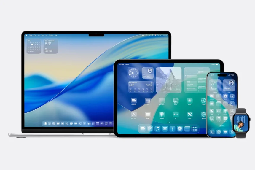
Apple’s upcoming iOS 26 update, now in beta, introduces a bold new design language called Liquid Glass. The update brings system-wide transparency effects and layered icon styles that add depth and a glossy, glass-like finish to the interface. The dock, app folders, and even the Home Screen search bar all make use of these translucent visuals, with a new Clear appearance option pushing the effect even further.
It looks sleek – but for some users, all that transparency can make things harder to read. Thankfully, Apple has included accessibility tools that let you dial back the effect without losing the overall iOS 26 aesthetic.
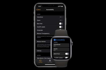
How to Reduce Transparency in iOS 26
The quickest way to tone down Liquid Glass is with the Reduce Transparency option:
- Open Settings on your iPhone.
- Go to Accessibility.
- Tap Display & Text Size.
- Toggle on Reduce Transparency.
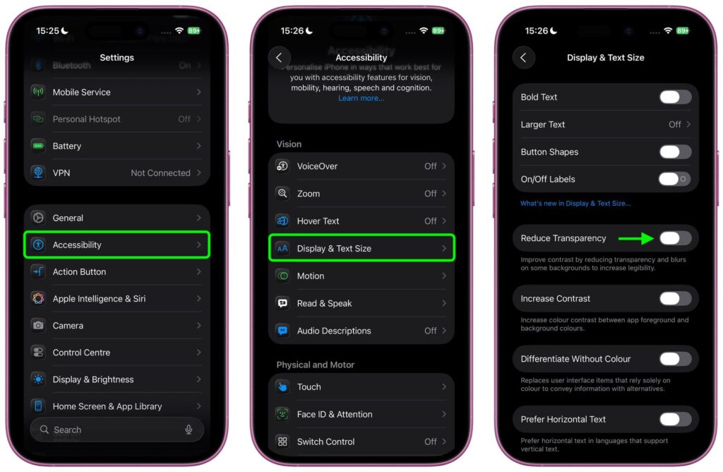
This doesn’t remove transparency entirely but replaces some translucent elements with darker, more opaque backgrounds. You’ll notice clearer separation in places like Control Center, app icons, and folders, improving readability while keeping the design intact.
Add a Quick Toggle to Control Center
If you’d like to switch between the full Liquid Glass experience and a more opaque interface on the fly, you can link Reduce Transparency to an Accessibility Shortcut:
- Open Settings ➝ Accessibility.
- Scroll down and select Accessibility Shortcut.
- Choose Reduce Transparency.
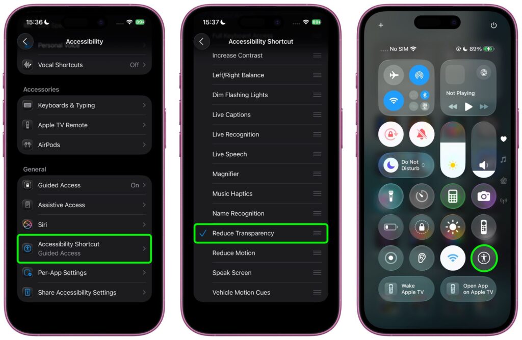
After this, you can add the Accessibility Shortcut to Control Center, letting you enable or disable the setting with just a swipe and tap.
More Contrast Controls
Still finding things hard to read? Head back into Settings ➝ Accessibility ➝ Display & Text Size and toggle on Increase Contrast. Used alongside Reduce Transparency, this significantly cuts translucency from icons and other elements, giving the interface a stronger, high-contrast look.
Since iOS 26 is still in beta, Apple is expected to fine-tune the Liquid Glass visuals before the official release, which is anticipated in September. For now, these accessibility options are the best way to strike a balance between Apple’s new design and everyday readability.
- Get Apple Watch Battery Alerts on iPhone
- Configure iPhone Accessibility Settings
- Free Up Space on iPhone


