

Recall continues to evolve and prove itself as an increasingly valuable feature. While initially it seemed like a promising idea that might require us to change how we work, over time it has quietly become more helpful-and with the latest update, even more so.
A Fresh New Home Screen for Recall
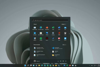
In the most recent update rolled out to the Dev and Beta channels, Recall introduces a new home screen. This fresh interface gives users a snapshot of their activity over the past 24 hours, helping them easily revisit recent apps, files, and content. It now highlights frequently used applications and allows you to search your digital history with ease.
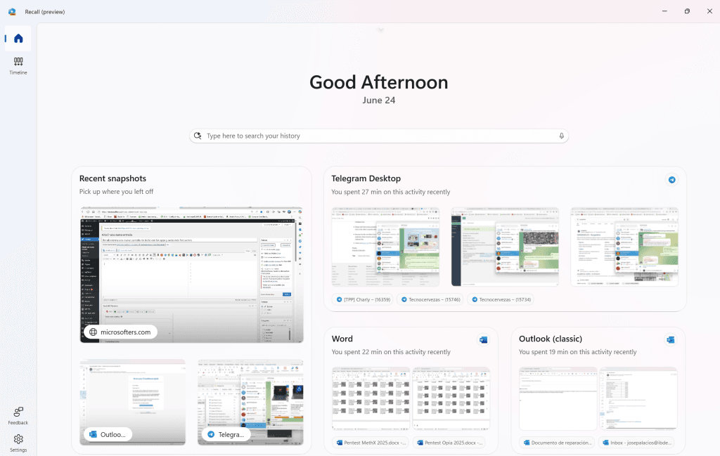
On the positive side, the new layout feels thoughtfully designed, placing the search bar and relevant content front and center for a more streamlined experience. It’s clear Microsoft is trying to make Recall a true productivity hub.
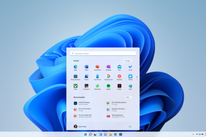
However, the design inconsistency across Windows 11 remains an issue. Recall now borrows its look from other parts of Windows, such as the Microsoft Store and widgets panel. While this approach has merit, it underscores a broader UI problem: Windows 11 lacks a unified design language.
For example, the Photos app still uses the older Windows design, while the Clock app has dropped the traditional hamburger menu entirely. These mixed UI styles contribute to a visually fragmented experience that Microsoft should address if it wants Windows 11 to feel more cohesive and modern.
Overall: A Step Forward for Recall
Despite some UI inconsistencies, the improvements to Recall itself are undeniably positive. The new interface gives quick access to:
- Settings
- Your activity timeline (though the icon could use refinement)
- A clean, helpful start screen
If this update is any indication, Recall is on track to become an essential tool in the Windows productivity toolkit. We’ll be keeping a close eye on its progress as Microsoft continues to refine it.


